
October 2022 - Blog Feedback + LR


Dyari GCSE Media blog feedback – October 2022

Work expected:

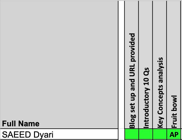
  • First blog questions

  •  Key Concepts film poster analysis

  • Fruit bowl task (Photoshop)

Post this in a new blog post on your Media blog called ‘October 2022 - Blog feedback and Learner Response’ then complete the LR tasks/questions below.

WWW:

  • Dyari, a brilliant start to Media. I can see that you are quite creative from your Photoshop fruit bowl task. I enjoyed the Nintendo Gamecube controller colour pallette.

EBI:

  • Ensure that your blog posts match your theme so that the font and size is all correct. Complete all extension work to get a top grade in Media

LR:

  1. Sort your blog post theme out on the first 10 questions blog

  2. Complete Grade 8/9 work for key concepts film poster blog 


Comments

Popular posts from this blog

Advertising: Key Connotations

  1)  - The picture of the product and it's contents (Skittles) remind us of what this advert is promoting. - The packing for the sweets is in the middle, with it's slogan under it and loads of Skittles behind it. The Skittles in the background are arranged in a rainbow, referencing it's slogan, "Taste the rainbow". - The background is a cloudy sky, further emphasising the rainbow theme of the sweets. - It's slogan, "Taste the rainbow", refers to the many fruity flavours Skittles has, and how colourful they are. - It's colour scheme is bright red with the frequent use of rainbows; this makes Skittles much more recognisable, and sets up a brand identity. 2) The USP (unique selling point) is the fact that Skittles come in many colours and flavours, allowing you to have a different taste experience from other sweets/candy brands. Many people like Skittles for the many flavours and styles they have available (e.g. Sour Skittles, Tropical Skittles, et...

Gender representation in advertising

  1) 2) 3) In the 1950's/60's, women were often portrayed as inferior to men. They were often portrayed as being servants to their husbands, always working around the house and weak/not "manly". It was very common to see adverts featuring women who were cleaning or serving dinner. For example, the first ad I've shown is a tie ad where a women is serving her husband, with the tagline "show her it's a man's world". The second ad promotes a cleaning product, and it shows a woman with lots of dishes surrounding her, with the tagline "Get out of the kitchen sooner!". The last ad promotes mustard "for men", in which it's tagline is "Are you woman enough to buy a mustard for men?". 4) In the early/post-2000's, women were often sexualised/portrayed as beautiful in a lot of adverts. They were often sexualised in a lot of perfume/beauty product ads. A few examples include the ones I've shown above. The first ad isn...

Paper 1 Assessment Learner Response (October)

  1) WWW: Dyari - a strong response for Q7 on Black Widow. You know the CSPs well in this paper. EBI: Not enough media theory/terminology to develop/extend responses. 2a) Typography - Upper case and bold, sans serif font used; connotations of importance and power 2b) Non-verbal codes - lighting signifies brand identity with logo being displayed as lights 2c) Photographic codes - Long shot signifies/shows power of the rugby player and his determination 3) Propp's character theory - Audrey Hepburn is the "heroine", the chauffeur is the "hero", the bus driver is the "donor" and the fruit cart is the "villain". Torodov's equilibrium theory - Equilibrium is first established in the calm, and peaceful town. Disequilibrium is then shown by the fruit cart stalling Audrey Hepburn's bus. A new equilibrium is established once the chauffeur takes Audrey Hepburn on her journey. 4a) Serif font conveys formality and high class 4b) Use of green colou...