
1)
- The picture of the product and it's contents (Skittles) remind us of what this advert is promoting.
- The packing for the sweets is in the middle, with it's slogan under it and loads of Skittles behind it. The Skittles in the background are arranged in a rainbow, referencing it's slogan, "Taste the rainbow".
- The background is a cloudy sky, further emphasising the rainbow theme of the sweets.
- It's slogan, "Taste the rainbow", refers to the many fruity flavours Skittles has, and how colourful they are.
- It's colour scheme is bright red with the frequent use of rainbows; this makes Skittles much more recognisable, and sets up a brand identity.
2)
The USP (unique selling point) is the fact that Skittles come in many colours and flavours, allowing you to have a different taste experience from other sweets/candy brands. Many people like Skittles for the many flavours and styles they have available (e.g. Sour Skittles, Tropical Skittles, etc).
Extension Tasks:
1) A clear brand identity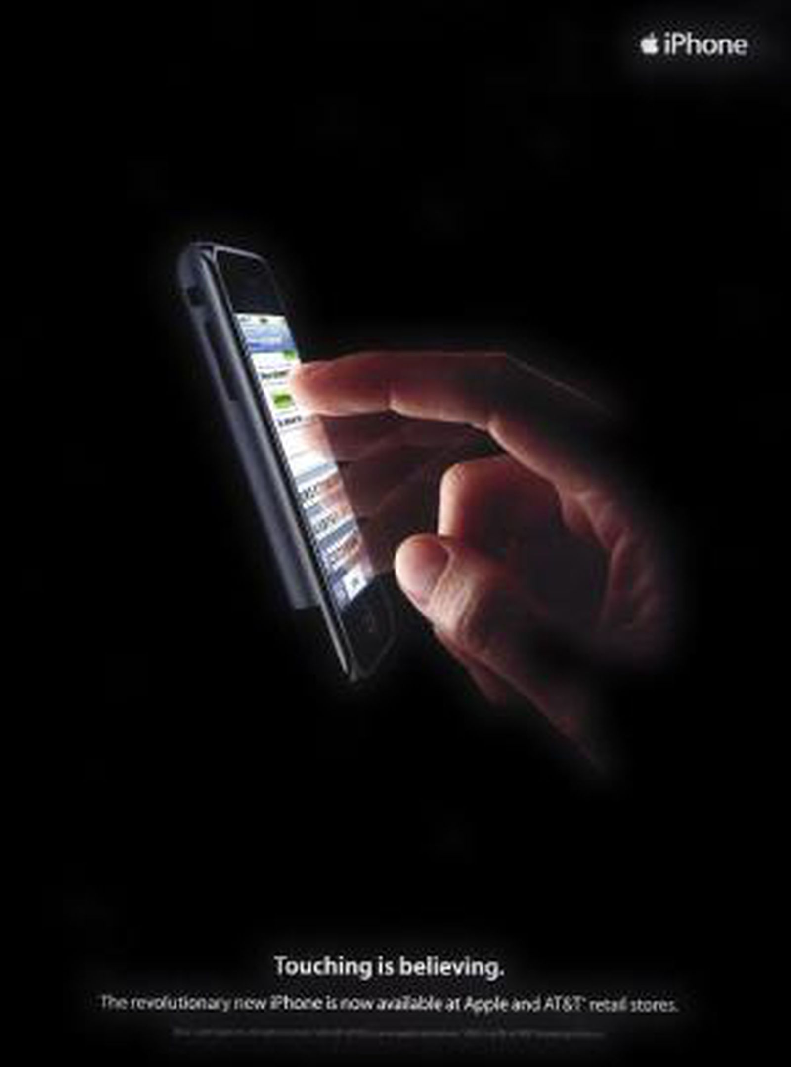


One of the first iPhone print adverts advertising the now popular smartphone brand. People know it's from Apple with the "i(Device/Product)" branding and the iconic Apple logo.
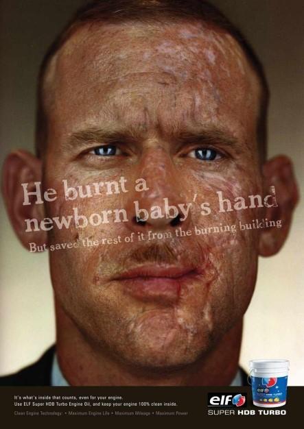
2) A shocking/controversial idea
A controversial print ad that starts off with a shocking sentence, then reveals what actually happened. The message is that "it's what inside that counts", which is the sentence trying to advertise this brand of engine oil.
3) An emotional connection to the audience
An emotional/shocking PSA from TFL. This ad warns people about the dangers of not looking while crossing the road. A series of these ads contains 2 sentences, both of which say: "My friend saw the (blank)", "They didn't see the (blank)". This makes the audience feel sad and emotional and encourages them and their friends to look both ways and stay safe, to avoid a potentially fatal accident.
4) An innovative/different subversive concept
4) An innovative/different subversive concept
This Burger King ad shows how fresh their ingredients are by showing the audience a mouldy Whopper. The advert exclaims it's "the beauty of no artificial preservatives", telling and showing the audience that Burger King does not use any chemicals in it's food unlike other chains and restaraunts.
5) A foreign advert that you can understand despite the language barrier
This Australian McDonald's ad features nothing but a wi-fi symbol made out of fries and the text on the bottom right, "love free wi-fi". Even if you don't speak English, you could still clearly understand what this advert is referring to, meaning the audience can understand what McDonald's is advertising despite the language barrier.
Comments
Post a Comment